









This is a selection of event collateral I designed for The Auckland Street Art Festival. The client wanted something quite abstract, so I created a deconstructed visual of Auckland. The design was rolled out across all event materials.

The Surf Coast Trek is a fundraising event that takes place on the Great Ocean Road Trek. Participants are sponsored for their efforts and all proceeds go to Kids+. I was briefed to create the look and feel for the social promotion through to the Fundraising Toolkit. The design reflects the ups and downs, the grittiness and the sand of the path that is taken. Once the design was established, I then rolled out all the social media tiles, Superscreen artwork, posters and the Fundraising Toolkit PDF document.

After many long years having a very outdated and complicated logo, the client was open to a new logo and branding. The logo was kept simple and for the branding, I incorporated smudged, blurry colours to convey movement and the different areas of the touring route - one example is the spray off the ocean along the coast.

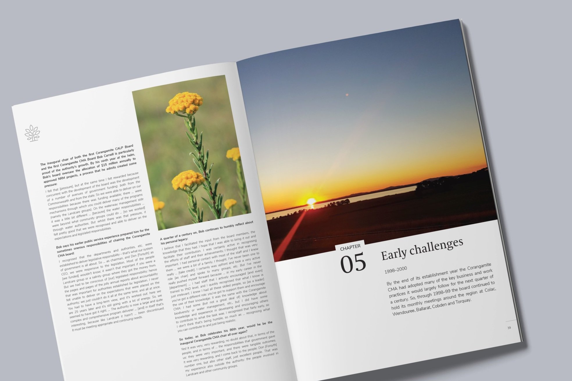
This book was to celebrate the achievements of the Corangamite Catchment Management Authority since it began 25 years ago. The client wanted it to look high end with a coffee table book look and feel.

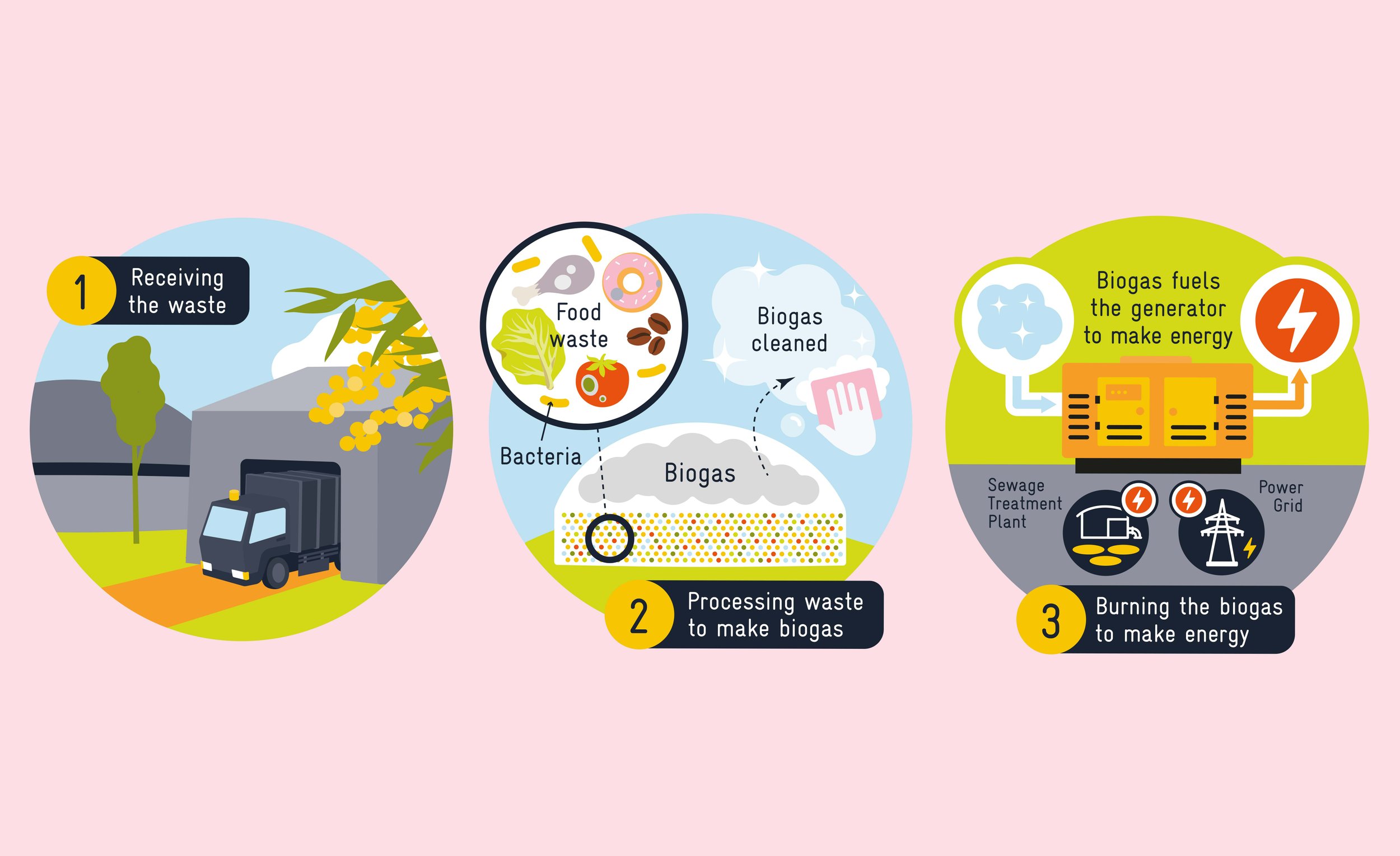
The client, Yarra Valley Water required a visual look and feel for materials that would be used to inspire people to understand the possibilities of having a new facility in their area that would take food waste and convert it into energy.

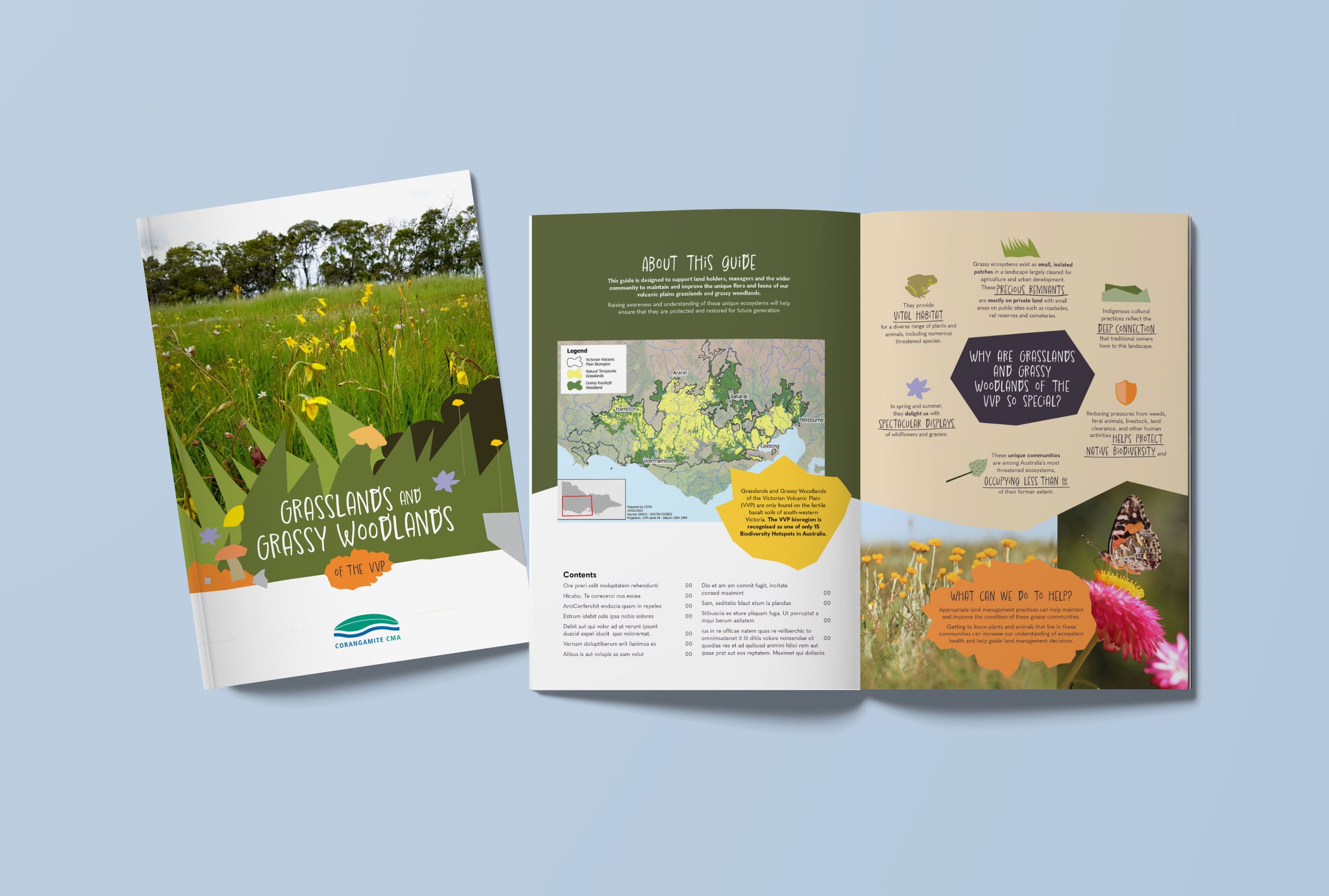
This guide was to support land holders, managers and the wider community to maintain and improve the unique flora and fauna of the volcanic plains grasslands and grassy woodlands of the Victorian Volcanic Plain. I was briefed to create a design that was beautiful, clean and clear so that the landholders could easily understand the content and enjoy the guide.

The client required a number of social media tiles to be designed to communicate to customers of emergency works.

This is an alternate version for the Grasslands of the Volcanic Plains Guide (shown earlier in the design section). It is my preferred version but the client decided to go for the cleaner option.

This was an interactive PDF I was briefed to create for Barclays. The PDF’s purpose was to explain to their customers what they offered in terms of offshore banking. I designed an introductory diagram to show customers the possibilities of offshore banking with Barclays (bottom left and middle). This diagram was used as a design feature throughout the document, changing state and position on each page.

This was a press advertising job I did for Babyliss Pro. They wanted to relaunch themselves to the market as a premium brand, their main competitor being GHD. I was briefed to create a clean cut, high fashion brand feel.

This is an event design job I completed for Astellas. The event was to take place at the National Maritime Museum Amsterdam, an image of which had to be employed within the design as requested by the client. Other materials for the event not pictured here included pull-up banners, a lectern panel, posters and name cards.

The Entrepreneur was a television show concept centred around finding a stand-out entrepreneur. We were briefed to put together the branding. Starting with designing the logo, we then had to churn out examples of what all the brand materials would look like. Above is a small selection of what was presented to the client – the website, handout, and business cards.

This was a PR Pinterest campaign for Boehringer Ingelheim based around different aspects of COPD titled A-Z of COPD. Everyday there would be a different topic relating to COPD starting with that day’s letter and I had to represent the topic in the form of that letter.
